This guide explains the key concepts behind the VQC Playground, from the quantum circuit to the final plot.
1. What is a VQC exactly?
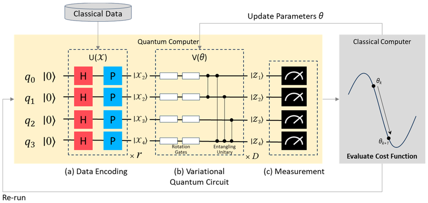
A VQC stands for Variational Quantum Classifier.
Think of it as a hybrid AI model that uses both a classical computer and a quantum computer (or, in our case, a simulator).
Classical Part:
A standard computer optimizer (like COBYLA in our code) is the "teacher." Its job is to find the best settings for the quantum circuit.
Quantum Part:
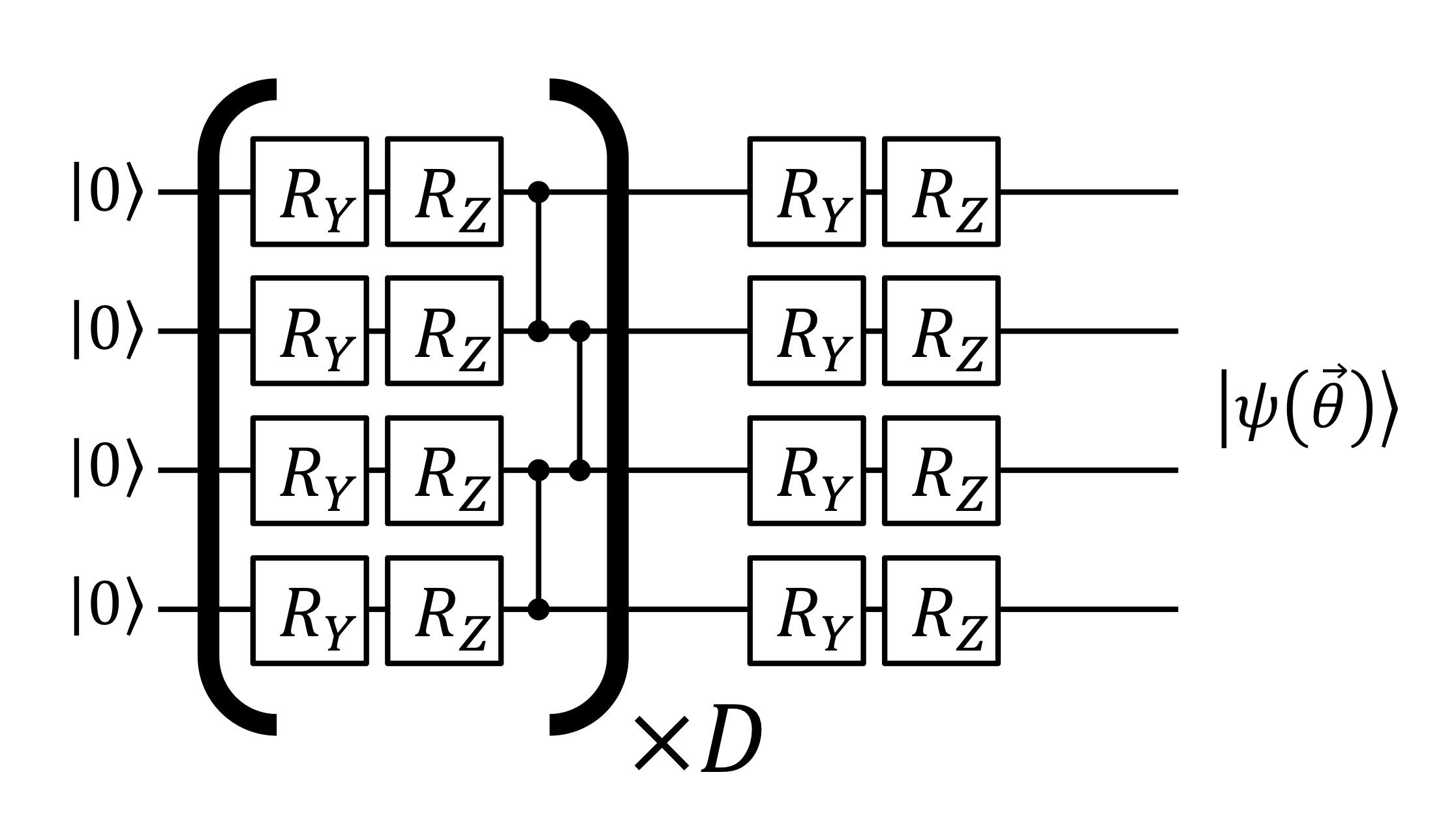
The quantum circuit (our ZZFeatureMap + RealAmplitudes ansatz) is the "student." It's a special circuit with tunable knobs (parameters).
"Variational":
This term means the classical "teacher" varies the "student's" quantum knobs, checks the results, and "teaches" it to get better, just like a classical neural network learns by adjusting its weights.
2. How do you map a VQC circuit to decision boundaries?
This is the core of the project. We don't draw the boundary directly. Instead, we sample the entire space and let the VQC's predictions create the boundary.
Here's the process:
- Create a Grid: We create a 20x20 grid of invisible points covering the entire plot.
- Encode Data: For each grid point [x, y], we "imprint" it onto a quantum state using the Feature Map (ZZFeatureMap).
- Process with Ansatz: We run that quantum state through our trained Ansatz (RealAmplitudes). This is the part of the circuit that has "learned" the pattern.
- Measure: We measure the final quantum state. The VQC is trained to output 0 (for Class 0) or 1 (for Class 1).
- Visualize: We color the area around that grid point based on the VQC's prediction (e.g., Red for 0, Blue for 1).
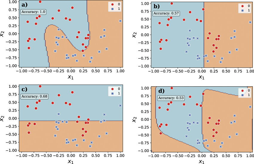
The decision boundary is the "coastline" that emerges where the red and blue regions meet. It's the exact line where the VQC's prediction flips from one class to the other.
3. What does the quantum plot display?
The plot shows three layers of information:
The Data (The "Problem"):
The individual circular points (Setosa, Moons, etc.) are the actual data we used to train the model. This is the "ground truth."
The Model's "Mind" (The "Solution"):
The light red and blue shaded background regions are the decision boundaries the VQC learned. The red area is the region where the VQC thinks all points should be "Class 0." The blue area is where it thinks all points should be "Class 1."
Your Test Points (The "Test"):
The star-shaped points are the new, "unseen" data points you create by clicking. They show you how the already-trained model classifies a new point in real-time.
4. Understanding the Legend
The legend is simple:
● Red Points / Red Region (Class 0)
Represents the first class in the dataset.
- For Iris, this is "Setosa."
- For Moons & Spirals, this is "Class 0."
● Blue Points / Blue Region (Class 1)
Represents the second class in the dataset.
- For Iris, this is "Versicolor."
- For Moons & Spirals, this is "Class 1."
⭐ Star (New Prediction)
This is a point you just added. Its color (red or blue) shows the class the VQC assigned to it.
5. How do new points get classified and what do the new classes signify?
When you click on the plot, a simple 3-step process happens:
- Click Event: Your browser gets the [x, y] coordinate of your click.
- API Call: The frontend sends this [x, y] point to the /api/classify endpoint on our FastAPI backend.
- Quantum Prediction: The backend takes your point, scales it (very important!), and feeds it into the already-trained trained_vqc model. The model runs the quantum circuit once (no training, just a fast prediction) and returns the predicted class (0 or 1).
The new class (Setosa, Versicolor, etc.) signifies which category the quantum model believes your new point belongs to, based on the patterns it learned from the original data.
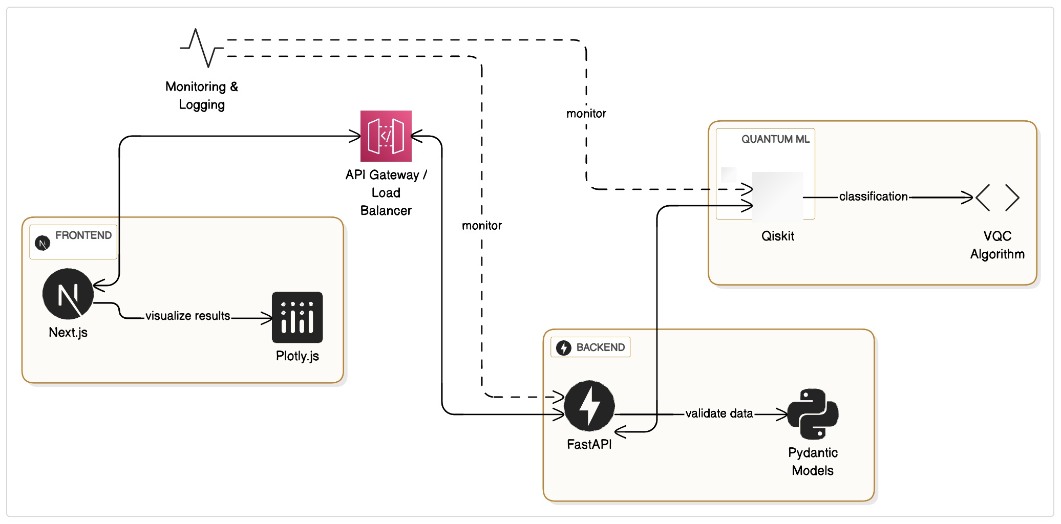
6. Practical Implications
This project is a hands-on introduction to Quantum Machine Learning (QML).
Why it's helpful:
It proves that we can use quantum circuits as powerful classification models. The make_moons and make_spirals datasets are impossible to solve with a simple straight line (a linear classifier). This project shows that a VQC can learn complex, non-linear boundaries.
Real-Life Implications:
For 2D problems like this, a classical AI model is faster and cheaper. However, the true power of QML is theorized to be in problems with massive, high-dimensional data—problems so complex that classical computers can't even begin to find patterns.
Future of Quantum Computing:
This playground is a "toy" version of the same technology that might one day solve some of the world's most complex problems in drug discovery, materials science, optimization, and finance.